Choice of colours
The color of the spaces and of the objects you equip them with, have the ability to influence people’s moods, and affect the apparent proportions of the space. It is used to create climates and different styles.
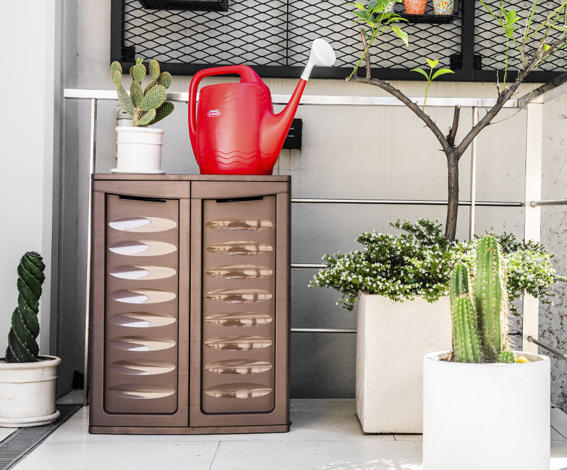
Warm colors (Yellow, Red, and Orange hues) are considered uplifting and appear to make the space larger. Cold colors (Green, Blue, and Purple) evoke feelings of rest and appear to make it smaller.
There are 2 basic options to combine them, according to the sensations that you want to produce: Harmony or Contrast.
-Harmony: when the integration of all the colors produce a balanced unit insight.
-Contrast: when the union of several colors produces a kind of clash that creates a dynamic chromatic unity.
The color chosen for your spaces will have a direct effect on the mood of the people who live there. Make your choice of color consciously.